
- Leigh Gregurke
Sins of the Wreckers is a work of layers and foreshadowing, depth and memory.
It can be easy to attribute these traits to the book as a whole and by default is often credited to the writer. Sometimes it can be easy to forget the role a colourist plays in the process and their ability to tell the story visually. This is a book that highlights the power of the colourist and their role as a storyteller in their own right.
In part one I examined the use of high contrast tonal composition spaces and the role of black and white in Roche's art being a wonderful reflection of the themes of the work. Josh Burcham as colourist adds other elements through colour and I wanted to explore just a few of the crafty methods employed to pull the viewer into the themes.
 | |
| IDW |
 | |
| IDW |
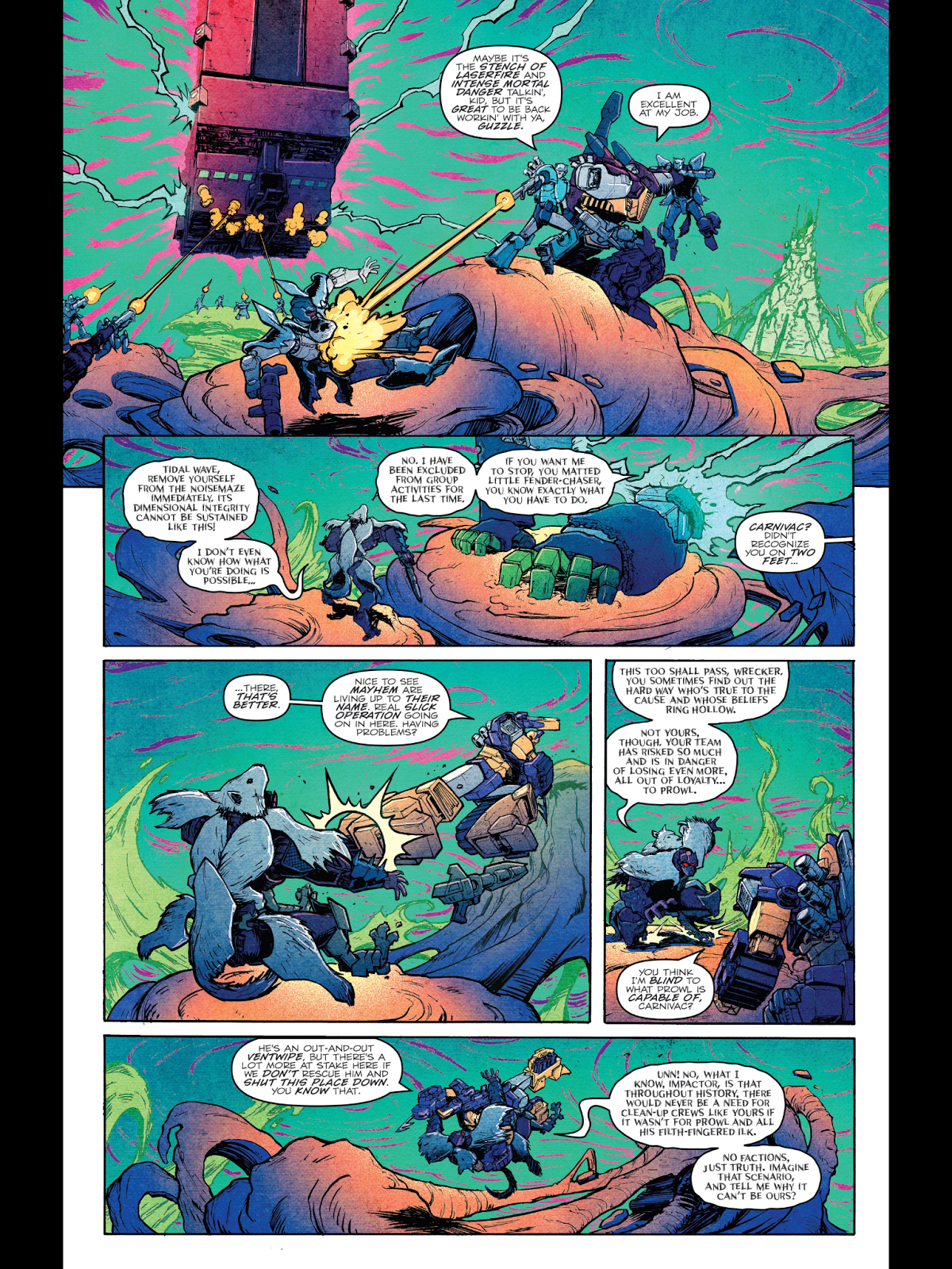
Complementary colour schemes pull from opposite sides of the colour wheel, working with the warm and cool balance and are commonly used in visual media. In this work Burcham really allows those contrasts to not just visually read in a pleasing way but assist the story and create a space and mood. Burcham also makes use of the contrasts of value, points of high and low saturation. Starting the work in a low saturation cold duality of space and snow gives a blank canvas where the emergent Noizemaze jumps out in intense and powerful contrast. By keeping colours in low saturation early we feel the coldness of space, the starkness of the snow and shadowed depths of the Ocean. Moments of importance are road-mapped through colour, the reader is drawn to visual elements and without text is able to grasp the narrative. Reading back over the series it's lovely to see the slow burn of the beginning. Issue one visually reads very differently to a later entry, while the spaces characters occupy become tighter and more claustrophobic, the intensity of colour ramps up considerably.
 |
| IDW |
The same complimentary colour tool is utilized to create links to characters. In the image above the usage of green makes us very aware this is the character Springer's room and he is missing from the gurney, even without his visual presence on the page. The red pops at the top of the piece, obscuring the local character colours with source lighted red. The tone here is more important than the characters visual identity as individuals. Red demonstrates a mood and narrative space of emergency but the reveal is in the opposite green, utilizing the cooler colour to not only represent the character Springer but aligning the cooler colour with surprise giving it weight over the top half's intensity, the combination works visually but also wonderfully transmits the story. Most masterfully perhaps is the composition and colour of the room. The medical equipment's style and colour foreshadows later panels in the climax, giving hints of both the characters origin and providing a visual mirror to the scenes in the green lit caverns that await.
 |
| IDW |
The same colour palette returns but reversed, enveloped by black and centrally iconic, Springer's green is contrasted by the red ground in the following panel. The first and final panels here demonstrate a common contrast in the work, visually showing both the togetherness of the group and highlighting their interior isolation through flat blacks and central panel placement. The red panel becomes dominant through its mostly saturated hue and, united with Roche's art, reads as the interior trauma creating a powerful visual contrast with Springer's heroic stature and pose in the larger panel. Composition wise Roche chose to place the upper panels sitting physically over the bottom panel, even though we end with the character centrally iconic again in a power pose we know to be the dominant emotion that is underpinning the character. Once again the use of colour providing links to characters' past and futures is utilized expertly, with the handling of one distinct red hue we are transported to another book entirely, reminded of the events of Last Stand of the Wreckers.
 |
| IDW |
Perhaps my favorite tool employed in this work is one of the more subtle. Drawing back to the tonal contrasts between black and white in the work; scenes of memory or recollection are given a gradient wipe in the borders, an almost cinematic transition feel. The bright white of the border disappears into black. Frequently sequential work and cinema scenes of recollection call on sepia tones, desaturated tones and blurring of quality of line, none of which I find terribly creative or visually interesting. Burcham and Roche's colour and composition delivers the work tonally, memories are dark, challenging and ever present, echoing the visuals of Springer mentioned previously. Rather than pull colour from the memory Burcham bumps the hues showing intensity of action and emotion and amplifies their value. Almost vignette like black borders feel as though they are crawling into the visual space, held at bay by often intense uses of local and bounced light. In a book where the power of memories is paramount the colourist made a bold choice to place them at the forefront and give the tremendous narrative weight they needed.
Colourists are finally starting to draw some of the attention and praise they deserve. With the advent of artist accessibility through social media we have seen more ability to push past a tradition that sees a work often attributed to the writer almost primarily. When I first found an interest in sequential art I rarely considered the role of a colourist, now I find myself picking up books making a choice on the weight of who is providing colours. I find myself going back over old books I loved when I was younger and realizing how many times a certain colourist appeared. Through the work of artists like Josh Burcham, Tamra Bonvillain, Matt Hollingsworth and the tremendous work and advocacy of Jordie Bellair I feel that that more people are starting to understand the role of colourist as storyteller.
As always, keep it #Refined
Follow Leigh on Twitter at @AmbushThem