Wednesday 16 November 2016

Shape And Form As Character Signposts

- Leigh Gregurke


Our knowledge of the shapes and forms that depict our physical reality underpin a vital series of visual triggers or symbols, these assist us in creating initial understandings and responses to visual media. From animation and illustration to design and the creation of three dimensional objects; the way we respond to shapes has its roots in semiotics. A map of meanings allowing creators to design our emotive responses.

© 1984 Sunbow Productions, Marvel Productions, and Hasbro


Perhaps the most Iconic character of the Transformers universe, Optimus Prime is constructed primarily of squared forms and rectangles with right angles framing his form. What do we think and know about squares? We associate them as symbols of solidity, dependability, strength, resilience, honesty, firmness, tradition. Squares have a sense of equality and rigidity.... but they are also kind of boring right? yes however... that's Prime. As a character he reflects many if not all of these traits, a representation of traditional leadership, heroism, a father like figure of dependability and safety. Ironhide often at Primes side shares similar motifs and traits but also demonstrates the way squares can channel a certain aggression, a dedication to traditional values and ideas and a gruff demeanor against change.

How do we view round shapes, circles, spheres... They are kind of harmless, friendly, we think of iconic characters including Micky Mouse, Casper the friendly Ghost, Winne the Pooh, Jack Black, Pandas, Mr Blobby, That cop from Noddy... they are soft edged, safe and fun. Bumblebee as the Volkswagen Beetle, even more rounded than usual in his stylized design is a series of strong curves upon strong curves, his anthropomorphic form is not hugely different, round feet, rounded torso, round head and his horns don't even feel sharp, they are cute little curved extensions.  Cosmos appears as a rounded almost kitsch U.F.O form and his personality is equally spacey, nonthreatening curious.

© 1984 Sunbow Productions, Marvel Productions, and Hasbro.


Shape can however challenge that expectation and our first perceived instinct with great effect.  Unicorn, the giant Spherical Planet eating terror compensates ten fold by employing a black metal show quota of spikes across his form to obfuscate and defy his rounded form, his menace even grows as he sheds this form as he is revealed to not only be a planetary form but also a colossus anthropomorphic destroyer.   Consider Cliffjumper, the red counterpart to Bumblebee. Is part of his character strength  that he defies his shape? An exercise in contrast Cliffjumper is at odds with his stylized curves with his aggression and swagger but still, this trait works because of our assumptions on shape, the viewer sees the tension between shape and our expectations.


Analyzing the effect that shapes have on our perceptions raises interest in the design process and the history of Transformer character design. Did Bob Budiansky put initial character traits and ideas to the toys seen at the Tokyo Toy Fair based on these common responses? A lot is said of the cars vs jets subdivision but its more complex than that I believe. Consider a division of shapes and their meanings, a tension between stability and conflict. Soundwave as a villain character shares commonality with Prime. It is reflected in his shape, he is logical, calculable, a known quantity that does not break the norm, this as it odds with most of the Decepticon designs, primarily I see among their ranks shapes that challenge and show action. What shapes challenge and demonstrate action?


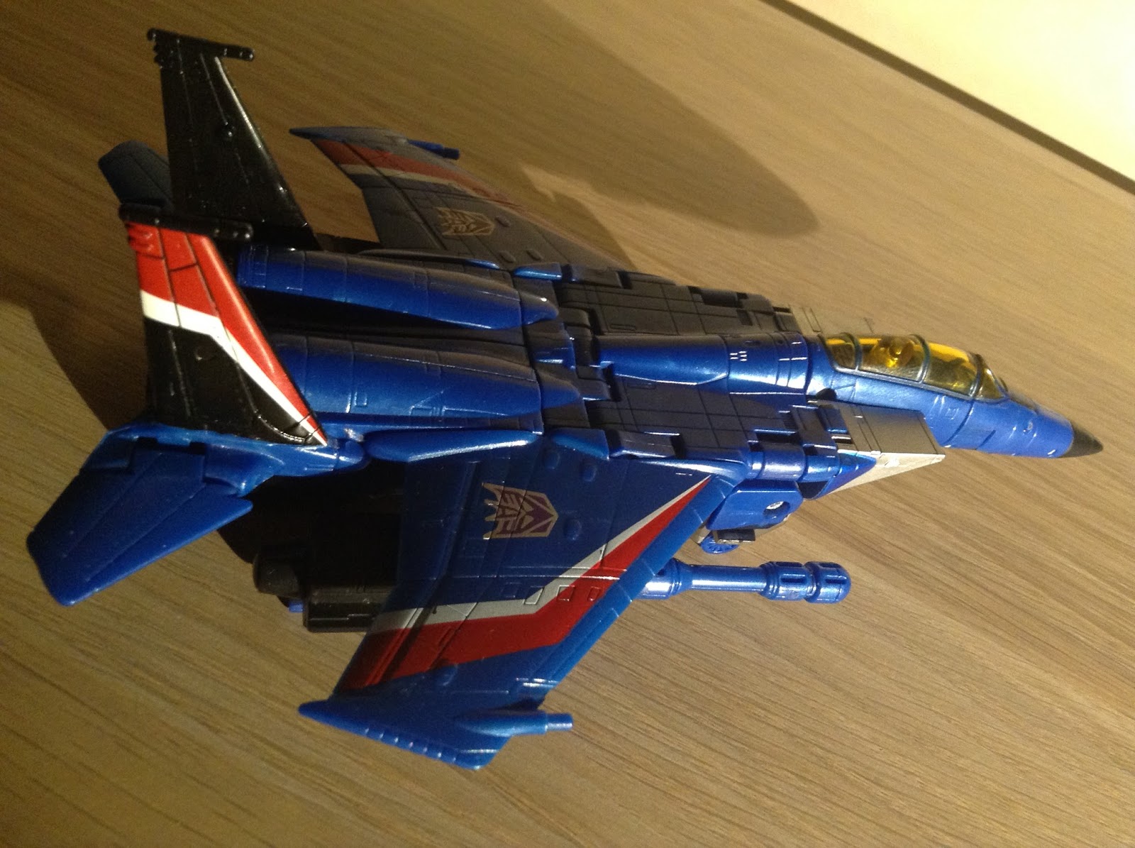
Triangles, Pyramids, Arrows.......Jets. Seekers. The "coneheads" for example employ a literal point at the top of their head. Triangles are motion and we think of  performance cars, jet airplanes, rockets, birds... they are dart shaped, flying triangles... our first vision of the Seekers in Transformers mythology is them as pursuing and dangerous flying pointed pyramid shapes. Triangles are symbolic vessels of speed, direction, movement, change and action. Compare the symbolic representation of the two presented factions in the mythology and the choices of shapes.


© 1984 Sunbow Productions, Marvel Productions, and Hasbro

The power of triangles as symbols of change is important when we examine the way Prime has evolved. The first major change in the fiction was his succession in the 1986 film. Hot Rod/Rodimus is presented with a dominant motif involving triangles, his ridiculous spoiler, his low angled bonnet, his leg stickers and head regalia, his giant kinda silly looking cape thing that the aforementioned spoiler forms. Hot Rod was an attempt to show on a very visceral and basic level through shapes that this character is a direct and powerful contrast to primes square.


The success of elevation as an iconic leader is debatable. Do we perhaps prefer the square for aforementioned symbolic elements it represents?  Comic fiction work has been able to explore the space with more success. James Roberts Literary work More Than Meets the Eye visually presents Rodimus in an energetic form of jutting angles through the art of Alex Milne/Nick Roche and others. Roberts inspires this with a character whom is presented as a fractured series of risks, motions and movements often at odds with another. Another example of the symbology of shapes in the work MTMTE  is the character Cyclonus showing an arc at odds with his pointed triangular motifs and their associated devil-like appearance, we even see one removed creating a physical alteration to the pointed shape, a blunting and change of physical shape as a demonstration of change.


Triangles can be seen as symbols of risk and danger, lust, aggression and temptation and audiences struggled to connect with the literal and figurative symbology of change. In time Prime designs started to reflect elements of change as his character did. Cybertron/Galaxy Force Prime begins a trend as squares are shunted at angles, a blend of his boxed core and directive lines. Animated Optimus demonstrated youth and growth, an angled triangle growing towards a emerging bold prismatic chest. Bay's movie Prime, well he murders people and I guess his design looks like that? A massive departure from from its rigid tradition and structure, Bay's Prime feels immensely conflicting in its overuse of heroic language tropes with Peter Cullen's voice work at odds with the depicted shape. Optimus Primal might be the most emotive, warm and relatable of the Primes and well, he was the most round in form.


Derrick J Wyatt's bold approach to design and visual storytelling created a universe where all characters demonstrated a sense of depth and warmth, Bulkhead is circles upon circles reflecting his humorous, seemingly harmless and friendly character and even villains have their comedic sides extenuated through exaggerated bulging shapes and forms. Wyatts Lugnut design evokes a comical yet powerful cyclopian form chained to a simple devotion with its exaggerated rounded forms. Even without much screen time, Animated Blackout's giant bulbous form absolutely drips character suggestion.


Shapes are a vital visual language that allow our brain to make quick leaps of thought and when utilized expertly by artists, designers and writers can lead us to a conclusion quickly without a need for exposition or conversely turn on a point creating challenging contrast and interplay. Think of some of the iconic designs that have appealed to you and ask yourself if the prominent shape designs match their character representation? How have some characters evolved and have their designs matched that path? Perhaps more so than some other mediums the Geometric focus of Transformers allows play with exaggeration with shape making those visual directions more obvious and allowing the creator more space to tell another layer of story.

I want to end on an important thought, Megatron. Not quite a square, not quite a point,  is he a  Phallus?  Megatron is; ultra confident, obscene, ego driven, violent, masculine and direct, his power resides in his Fusion Cannon and when it is lost so is his power, intentional writing or coincidence? I would love to hear your thoughts, experiences and feedback.


For further study I recommend the work on the Bouba/Kiki effect observed by Wolfgang Köhler and documented in his research in 1929 demonstrating a fascinating link in the way our brains connect shapes and sound connotations.


Follow Leigh on Twitter @AmbushThem

Seek and Destroy

- Ben Watson

This year marks the tenth(!) anniversary of the Transformers Classics line, a full decade of collector focused figures hitting shelves and stealing the limelight. So by way of commemoration of this milestone, let’s take a look at the most enduring offering from Classics, the Seeker mold. How does it hold up in 2016? Where does the design fall short? Where does it still offer something worthwhile? As the use of this body type is so extensive, I’ll be answering these questions by looking at the four Seekers I chose to part with cash for.


As with most aerial Decepticon line-ups, it all starts with Starscream. When looking back at G1 toys, the very first sore thumb of stunted design that pokes out is the Seekers, and among them none more than their leader. Easily one of the top four most prominent Transformers characters in all media, the original toy quickly fell behind the refined character design used to portray him. Being so iconic, it was to be expected that Starscream would receive such an update at the earliest convenience. That was however not the Classics line. A year previously Takara released their own first try at giving Starscream and company the look they deserved in the Robotmasters line but arrived at a rather stunted serving of Seeker. Classics would outdo this effort greatly thanks to the design work of the (then) huge TF artist extraordinaire Don Figueroa. Seeming to bring to life the design he had given Starscream in the latter days of the Dreamwave comics, Figueroa brought a modern sensibility to the styling of the figure and a certain amount of his own flair in details.


At the time, it was exactly what so many were itching for: Starscream “done properly”. But was it ever perfect? Eschewing the terrible QC issues my copy of the figure is laden with, let’s take a look at Starscream through an eye that’s now seen a decade of similar update efforts…


Beginning with the jet mode, yeah there’s really not much to fault here. (Apart from my copy being unable to sit flush along the back.) Possibly the strongest aspect of the Classic Seeker mold is the perfectly realised not-quite F-15 form. Square intakes, long pointed nosecone, translucent canopy, sweeping curves mixed with boxy edges and an overall layer of panel detailing. Maybe in this era of Titans Return you could say you’d like an opening cockpit. Maybe the landing gear isn’t quite up to par or the fuselage is a tad bulbous but for me this delivers everything it needs to. What’s more, it’s done so for all these years. In the intervening time we’ve seen sleeker Seekers but none have hit the right shapes as well as this.


What about robot mode though? The real meat and potatoes of any update is this form. After all, G1 never had any difficulties in delivering stunning vehicle modes. But slow down turbo, let’s converse on conversion.

To me the Seeker transformation has always felt iconic. The cockpit swinging down to make the chest in that unmistakable motion is something every iteration of the design needs. Does the Classics figure pull this off, first and foremost? Nearly. While the extra twists and folds going on here contribute to perhaps a more coherent torso shape, I’ve always felt that most simple and satisfying swing of the nosecone was missing from this Starscream. The resulting assemblage of joints almost feels like complexity for complexity’s sake, especially when the rest of the conversion is so simple. Extend the legs in that way you always wished the original’s would. Flip out the arms in a similar manner. Bring out the fists rather than plug them on. Tidy up the wings and attach the missile launchers. Overall, a transformation scheme that definitely echoes its predecessor but denies you the most fun part of what it had. That single most memorable tactile experience - a factor often overlooked in homage work- just isn't recreated with enough gusto. Oh well, better learn to enjoy it, you’re gonna have to sit through it a few more times…


Robot mode at last! A Starscream with defined joints at last! A chance to critique articulation at last! This figure is certainly a product of its time. Back when Cybertron had most recently finished its offerings of decently posable robots incorporating spring-loaded gimmickry, you couldn’t really have expected to see anything different from Classics. This robot mode is therefore in hindsight a mixed bag. Yes, Starscream now has elbows and knees where you’ve only ever imagined them to be. His head turns marginally and his hips and shoulders have full universal ranges. This is without a doubt, a posable figure of G1 Starscream but considering the level of articulation accepted as standard these days, it’s definitely stunted. Without any swivels in the arms, you’re left to awkwardly point his Null Rays at his enemies. Lacking meaningful twisting in the legs similarly hinders him. By no means was this “bad posability” in 2006 but it certainly leaves something to be desired in the years since. Years that have seen expressive joints such as ankle tilts and ball-jointed necks become more common and thigh and bicep swivels become industry standard. In the face of the last decade of engineering refinement, the Classics Seeker almost begins to feel as outdated as the toy it seeks to supersede! But all is not lost for this toy in the space year 2016…


While other efforts at bringing Starscream and his bros well and truly into the 21st century have come and gone, this one remains atop its plinth. Why? No other mass retail, general pricepoint Seeker has ever captured so well the overall look of the iconic design. Boxy limbs and torso outlined with the sweeping flourish of the wings. A translucent canopy front and centre that actually is the jet’s canopy. Tall intake pylons either side of a square and many-vented head. Square knee panels leading down to whatever those things on his shins are and long scoop-shaped feet… Every distinguishing detail of whichever Starscream you prefer to think of is captured and supported by a layer of modern sculpted detail. And nipples. We won’t mention them again.


To talk now of paintwork leads us down the very, very long and winding road I’ll call Seeker Street. But before we venture on we have to call at the first house. Classics Starscream tried something new with its deco, this much can be said. Simple stripes on the wings are extrapolated out into sharp chevrons. A dash of red is added to his arms in a similar fashion to the previous Energon and Cybertron Starscreams. Gold now enters the fray to replace anything that might have been foil stickers. In terms of paint, this isn’t entirely the Starscream you know. Here we are shown the trend which only Classics seemed to maintain among its update peers – a tip of the hat to incarnations of the character that weren’t G1. In an effort to create “definitive” editions of the characters, (or maybe to appeal more to kids) old and new were combined in this way. But it was soon clear no-one cared about the new and there you go, have a “proper” G1 deco in Universe 2.0 Starscream. Happy now? Oh what’s that, you want other guys too? You mean you’ll pay us for the same toy at least five more times? You can’t be serious…


Suffice to say there are a lot of Seeker variations out there after ten years. So many that this mold has been so thoroughly overworked, they had to issue a new one after just two. Yes you’ve got your Skywarps and Dirges and Ramjets and Sunstorms and loads more you’ve never heard of but for the sake of writing about what you know, we’ll stick to the three now languishing on my desk. Acid Storm marks my first lapse into the illness known as Seeker Repaints and before we begin, please take a moment to get all those jokes about drugs out of your system. Yes he’s green, he’s got the word “Acid” in his name… You good? Ok let’s go.


I never intended to buy Acid Storm. He was a repaint of a toy I already had at a time when spending pocket money on such things was simply stupid. He was a character I’d never heard of and neither had anyone else, but this begins to bring us to his appeal. I remember the day I first saw the figure “in the flesh” while asking to see which Universe deluxes Argos had in their back room. After the lady behind the counter produced only him, I turned my nose up but – for whatever reason- parted with ten-ish quid anyway. That Acid Storm went to sit on a shelf in my dad’s comic shop for long enough for me to begin to appreciate some indescribable quality of it. So I went back for another and held onto it this time, quickly feeling glad I did so as the satisfaction of having a toy you like in a more interesting get-up began to creep in. 


Acid Storm is a delight of militaristic green and camo topped with enough yellow to convey the character’s toxic vibe but with enough black and drab blue to stop that being garish. Silver face too! Something waxen grey Starscream sorely lacked. All in all, Acid Storm added up to be much more enjoyable than Starscream but maybe that’s only down to all his joints actually working properly. Not only did Acid Storm look better (to my utilitarian fanboy eyes) he felt better. I could finally enjoy a solid version of this figure! And one with an extra joint to boot. Through some edit of the mold (some sources claim most Seekers after 2008 are from the second press), the missing bicep swivel could almost be made up for by allowing the arms to recess into the chest on their conversion joint, at least letting you point his guns properly.


A couple of years passed and no more Seekers hit general retail until 2010’s seminal Generations line. For me, 2009 into 2010 was a massive high point for getting my hands on excellent figures, so all it took for me to buy wave one’s Thrust was the fact he had some different parts. Without having to feel I was looking at another straight repaint, I am guilty of snapping up my first Conehead purely from retool appeal.


Having never handled Ramjet, I was more than up for this variant of the thing I already knew so well. Metallic plastic sealed the deal. Using new wings, VTOL turbine parts (that could inexplicably detach) and the eponymous pointy noggin, Thrust was a welcome enough departure from the norm. With a deep barbecue sheen to most of his plastic accented by gold and silver applications and some odd chrome placement inside his cockpit, he’d certainly be very pleasing to the eye if the really-dark-grey-not-really-black of his chest, arms and feet didn’t drag the figure into Dullsville. With a couple of conversion steps less and noticeably thinner plastic, no amount of shine could ever win me over to thinking Thrust was the best of my Seekers. At the end of the day, he simply became the odd one out.


This is where we reach full circle. Or maybe the last corner of a square. My final Seeker segue came in the form of Generations Thundercracker. What a bang to go off with… This is the pinnacle folks.


Thundercracker is easily the very best Seeker variant I’ve handled and I don’t say that just because he’s my fave of the bunch anyway. Perfectly solid build quality coupled with this lavish deco just puts all the rest to shame. A much more slavishly G1 colour scheme really brings a feel of class to this figure. The widespread application of Hasbro’s shiniest silver paint to his torso is incredibly eye-catching. Couple that with the inherently metallic blue plastic (a property I fetishize to be honest) and Thundercracker is made truly mesmerising. Supplementary paint apps are crisp and add colour to what has since (see Thrilling 30 and the Combiner Wars Thundercrackers) become a really dull deco. There are plenty of Thundercrackers to choose from now but I must emphatically impress upon you that this is the best looking one. By no means the best figure if articulation is your deal, but we already know that by now don’t we? As my final F-15 foray, I certainly feel that the Seeker mold went out on an unsurpassably high note for me.


But by no means did use of the body end in 2011. New Seekers kept rolling off the assembly line and while general retail was finished with them, the likes of BotCon, Takara or Hasbro’s Asian end weren’t. One would hope we’ve seen the last of this mold now, as at time of writing TFCC Nacelle appears to be the swansong of the Classics Seeker. It’s time to put it bed, let’s be honest. While the mold delivered a sea of versions to choose from, some quite definitive, others completely needless – it simply doesn’t work to the 2016 standard. But what a testament to its versatility (or the devious nature of Hasbro and Takara deco designers) that it marched on for as long as it did. I’m ready for a Voyager one now, don’t skimp on the opening cockpit. Cheers. 


Follow Ben on Twitter @Waspshot23